The Hamburg Code for global warming
25 July 2018, by Christina Krätzig

Photo: UHH/CEN/C.Franzke
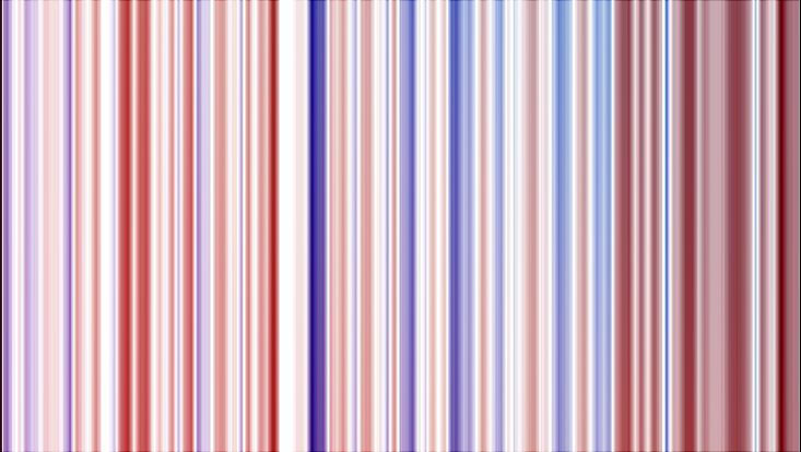
Dr. Christian Franzke from the Center for Earth System Research and Sustainability (CEN) has for the first time, depicted the annual mean temperatures for Hamburg in the form of a bar code - inspired by the “warming stripes” introduced by the British climate researcher Ed Hawkins. Franzke’s visualization shows the annual mean temperatures for the Fuhlsbüttel district from 1891 to 2017. Red tones indicate years with above-average temperatures, while blue tones represent unusually cool years. With regard to what motivated him to create his own Hamburg Code, Franzke explains, “The images convey a troubling message in a highly aesthetic way. I hope they’ll succeed in giving people a wakeup call.”
The data Franzke used came from the “European Climate Assessment & Dataset Project.” For Fuhlsbüttel, the records reach back for 127 years – much farther than in most other districts; for e.g. Bergedorf, the mean annual temperatures only date back to 1966.


.
.
The year with the highest mean temperature to date was 2014 with 10.7 degrees Celsius, nearly two degrees above average; the coolest year was 1940, with only 6.7 degrees. Further, there is an abrupt climb starting in 1990: from this point on, nearly every stripe is red; in other words, the annual mean temperature was nearly always above average. According to Franzke, who is an expert statistician, “That’s definitely no coincidence. The rise in temperatures is statistically significant and can’t be explained by natural fluctuations.”
Ed Hawkins from the University of Reading created the first climate bar codes only a few months ago. The idea has since caught on worldwide, and can even be seen on ties and coffee mugs.
Ed Hawkins’ Visualization Lab
European Climate Assessment & Dataset Project
More climate visualizations


